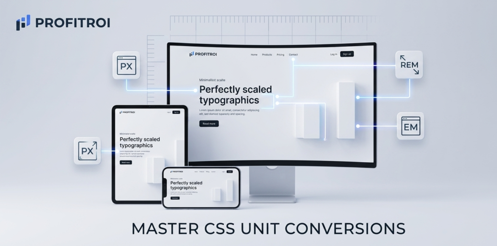
Focus Tool: Universal Multi-Converter (PX to REM / EM)
The Problem with Fixed Pixels Modern web design is all about “Responsiveness.” If you build a website using only Pixels (PX), your text might look great on a desktop but become unreadably small or awkwardly large on a mobile device. Pixels are fixed units, which means they don’t scale based on the user’s browser settings.
Why Developers Love REM and EM To create accessible, flexible websites, developers use relative units like REM (Root EM).
- REM scales based on the root font size of the browser. This means if a user has their browser set to “Large Text” for accessibility, your website will automatically scale to accommodate them.
- Efficiency: Using REM makes it much easier to manage spacing and typography across different screen sizes using CSS media queries.
Instant Conversion at Your Fingertips Calculated math while coding is a distraction. Our Multi-Converter at Profitroi.xyz lets you instantly swap between PX, REM, and EM. Simply type in your base font size, enter your value, and copy the code. It ensures your designs are pixel-perfect (and REM-perfect) every time.